Nami

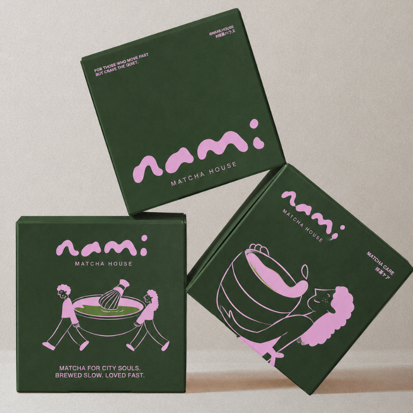
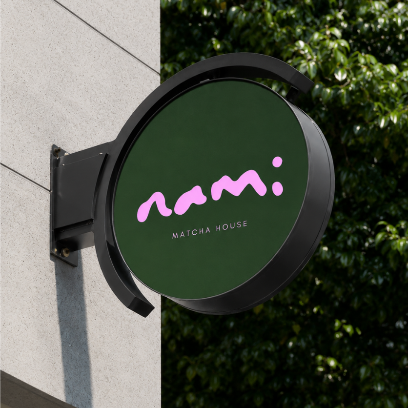
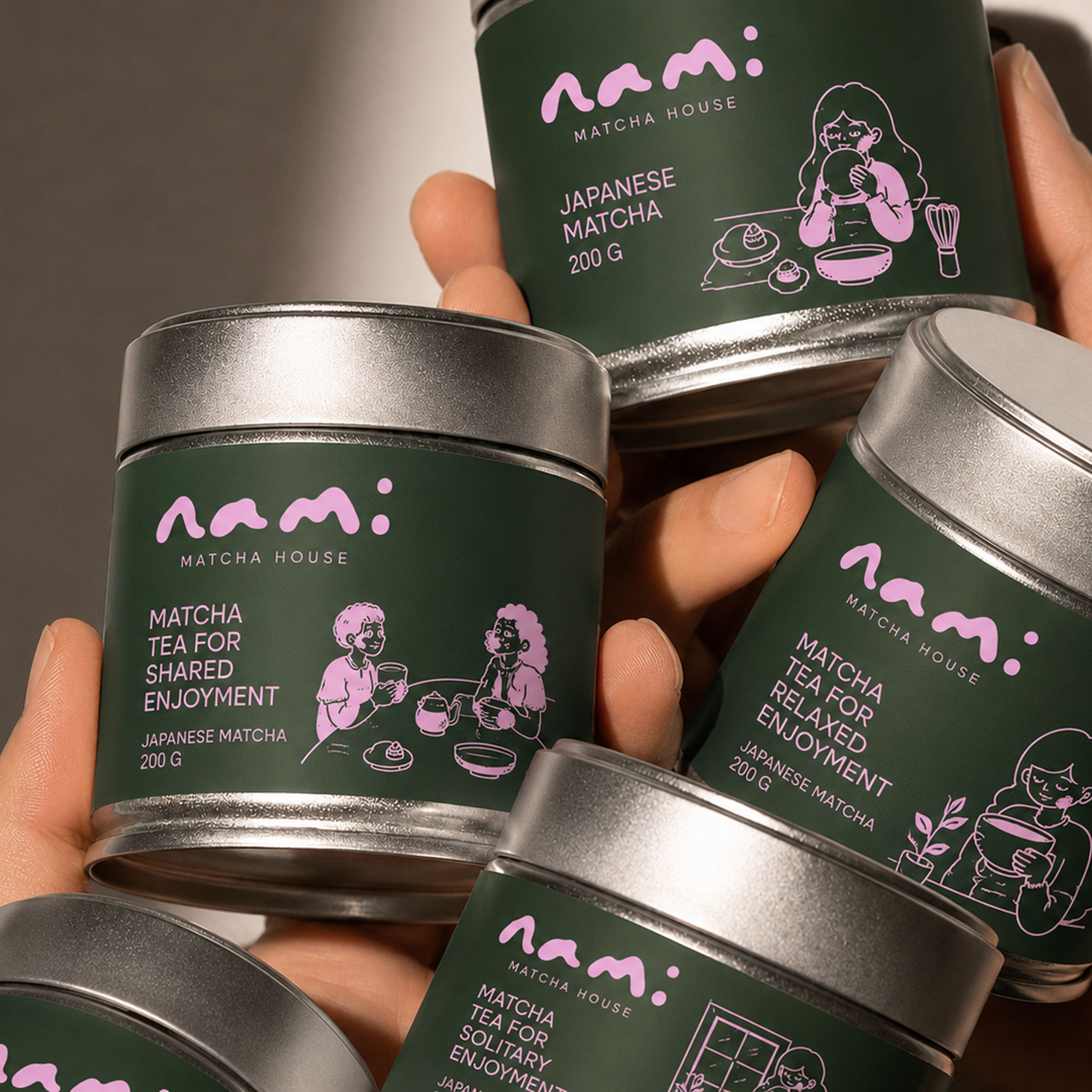
Nami was developed as a hypothetical brand concept exploring how thoughtful packaging can make a product feel distinctive, modern, and shelf-ready. The visual system combines expressive typography, a refined color palette, and simple graphic elements to create a cohesive identity that feels fresh and approachable. Every detail was designed to help Nami stand out while building a recognizable brand world that could extend naturally across packaging, digital, and retail touchpoints.

Duration
4 weeks

Industry
Food & Beverage

Project

Hypothetical Brand Case Study

Across the Nami range, the design balances personality with simplicity. Each product carries its own visual character through color, typography, and graphic details, while the consistent logo and layout system keep the brand cohesive. The result is a packaging direction that feels fresh, modern, and distinctive, designed to translate seamlessly across shelves, digital commerce, and future brand touchpoints.

Let’s bring clarity to what you’re building

A focused conversation to
understand your goals and
what matters most.